uRBAN dATASCAPES
This seminar pairs theories of technological “smartness” in urban environments with concepts and practices in critical cartography to investigate, both, the infrastructures ordering data collection and creation and the sociospatial systems of representation they engender. From sensors to social media, surveillance to resilience, decision making to community building: What are the means by which our data infrastructures are designed and planned? How do these systems influence urban research and visualization? And what implications do they carry for urban practice? Following close reading, discussion, and short response papers, the final project-based deliverable asks students to explore these questions through techniques of mapping and data analysis (qualitative and quantitative) comparing alternatives, narratives, and outcomes.
Featured here are excerpts and examples of projects from the Spring 2019 course. Format and medium choices vary, based on the seminar’s discussions of representation and visualization.

Jean Kim, Gloria Serra-Coch, Francis Yu. “Untangled” [paper, foam core, acrylic, embroidery floss]
The project’s accompanying documentation and description included below.
Project Abstract:
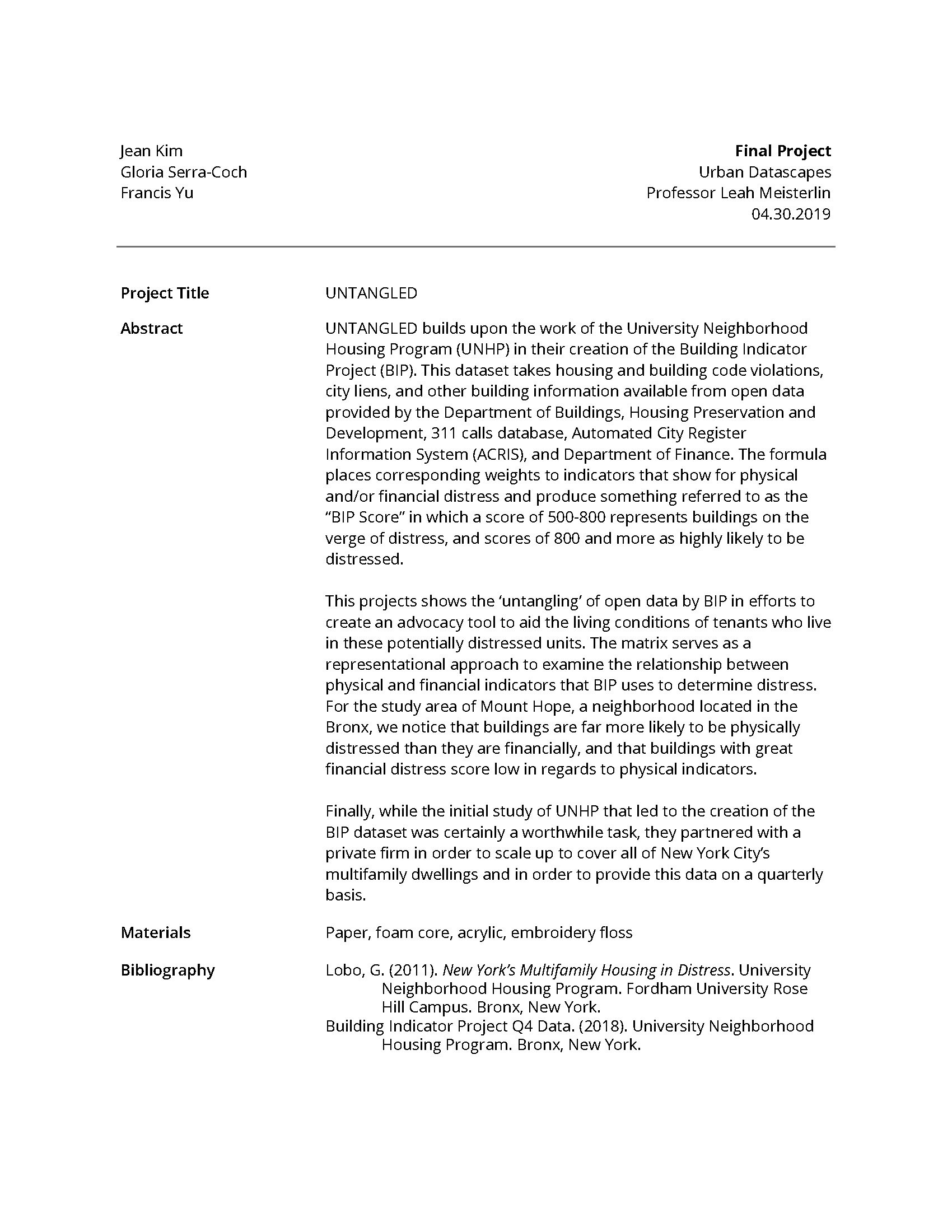
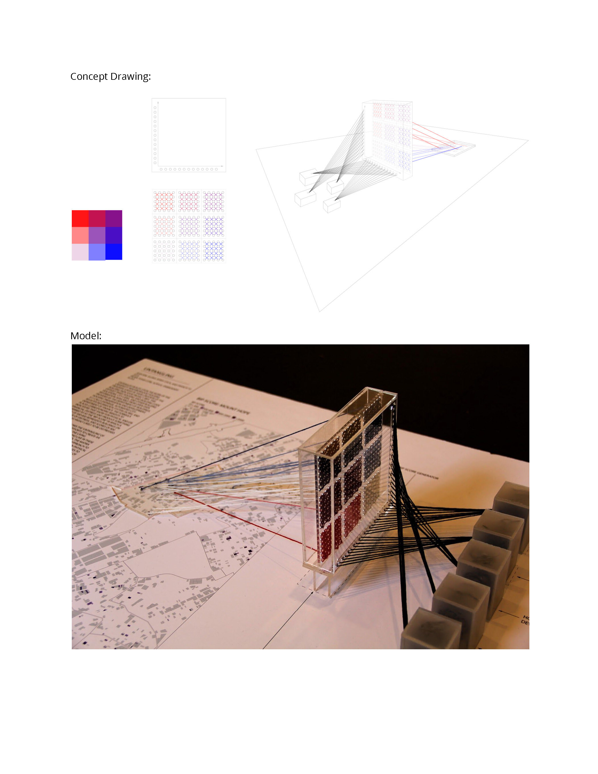
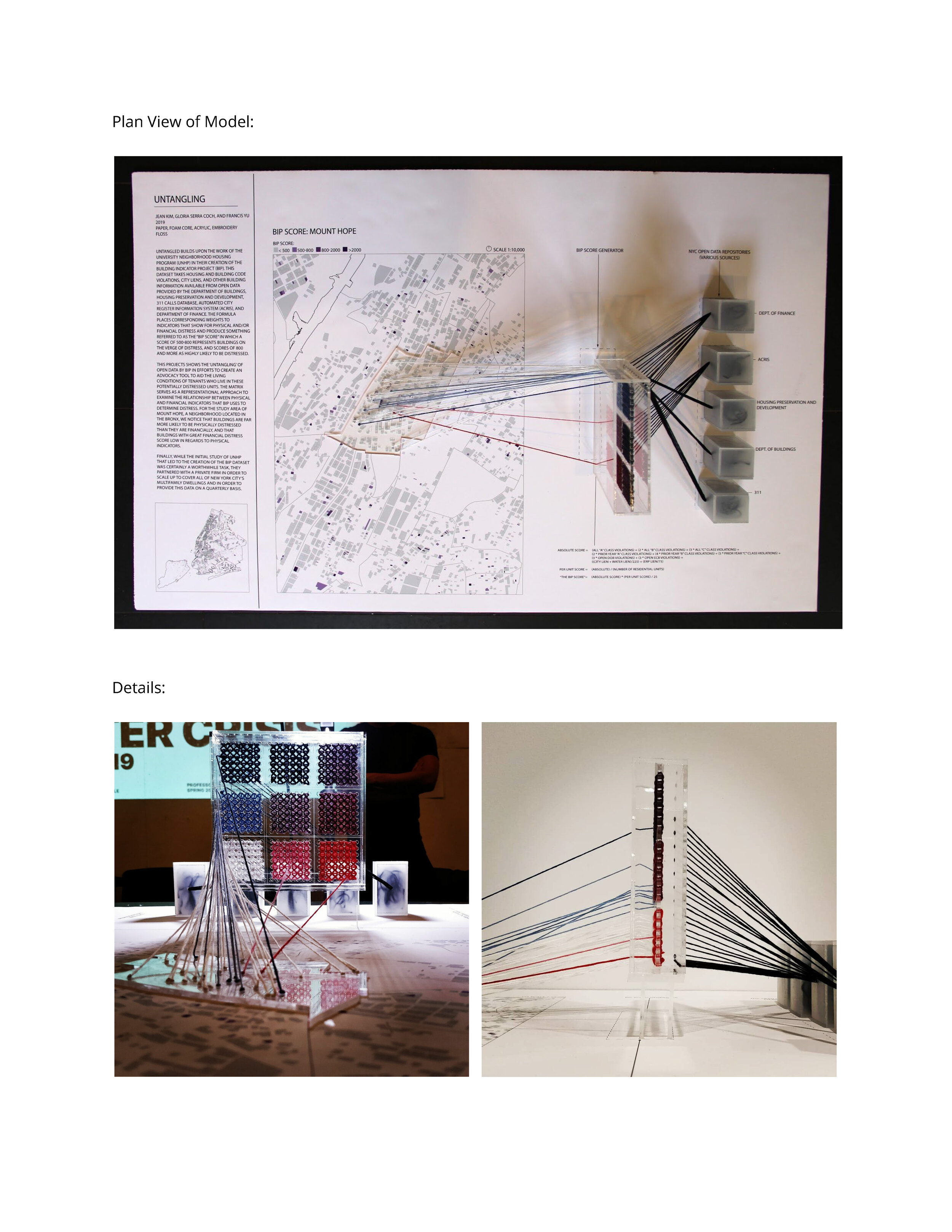
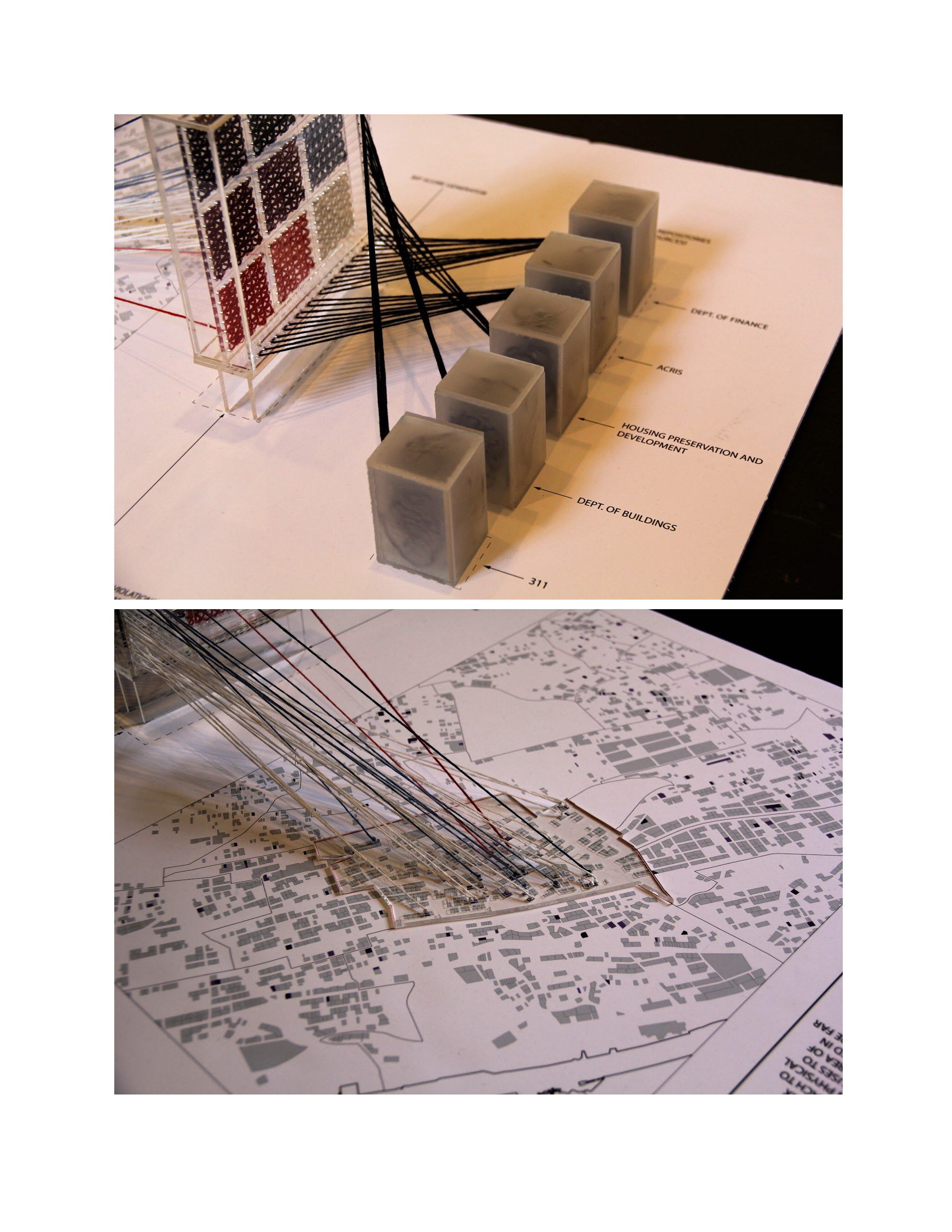
UNTANGLED builds upon the work of the University Neighborhood Housing Program (UNHP) in their creation of the Building Indicator Project (BIP). This dataset takes housing and building code violations, city liens, and other building information available from open data provided by the Department of Buildings, Housing Preservation and Development, 311 calls database, Automated City Register Information System (ACRIS), and Department of Finance. The formula places corresponding weights to indicators that show for physical and/or financial distress and produce something referred to as the “BIP Score” in which a score of 500-800 represents buildings on the verge of distress, and scores of 800 and more as highly likely to be distressed.
This projects shows the ‘untangling’ of open data by BIP in efforts to create an advocacy tool to aid the living conditions of tenants who live in these potentially distressed units. The matrix serves as a representational approach to examine the relationship between physical and financial indicators that BIP uses to determine distress. For the study area of Mount Hope, a neighborhood located in the Bronx, we notice that buildings are far more likely to be physically distressed than they are financially, and that buildings with great financial distress score low in regards to physical indicators.
Finally, while the initial study of UNHP that led to the creation of the BIP dataset was certainly a worthwhile task, they partnered with a private firm in order to scale up to cover all of New York City’s multifamily dwellings and in order to provide this data on a quarterly basis.

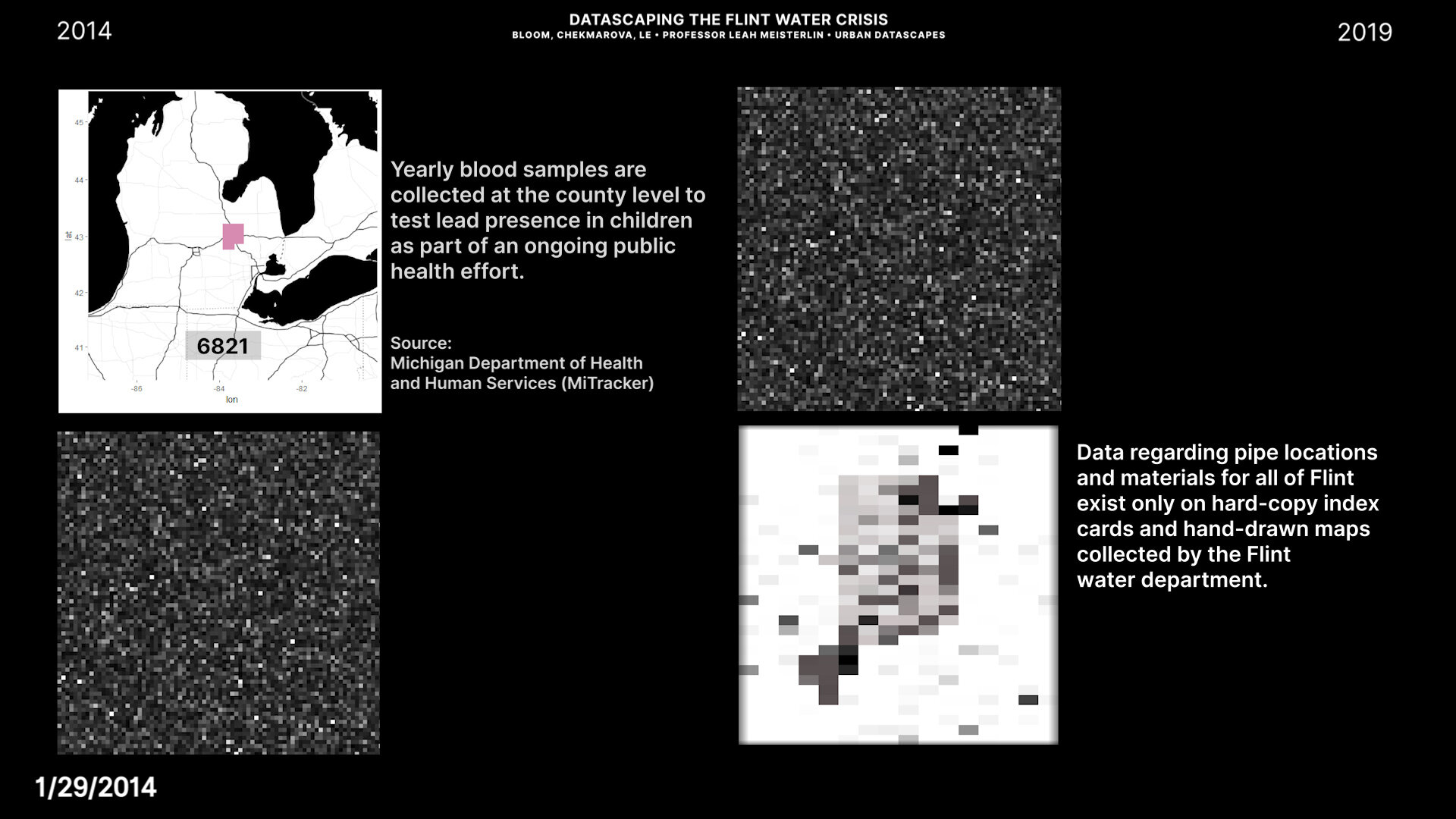
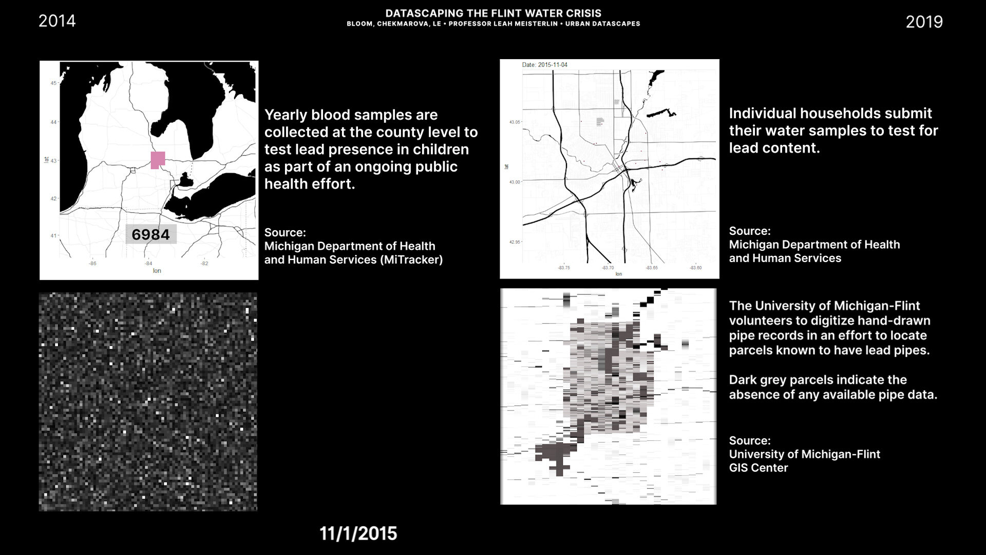
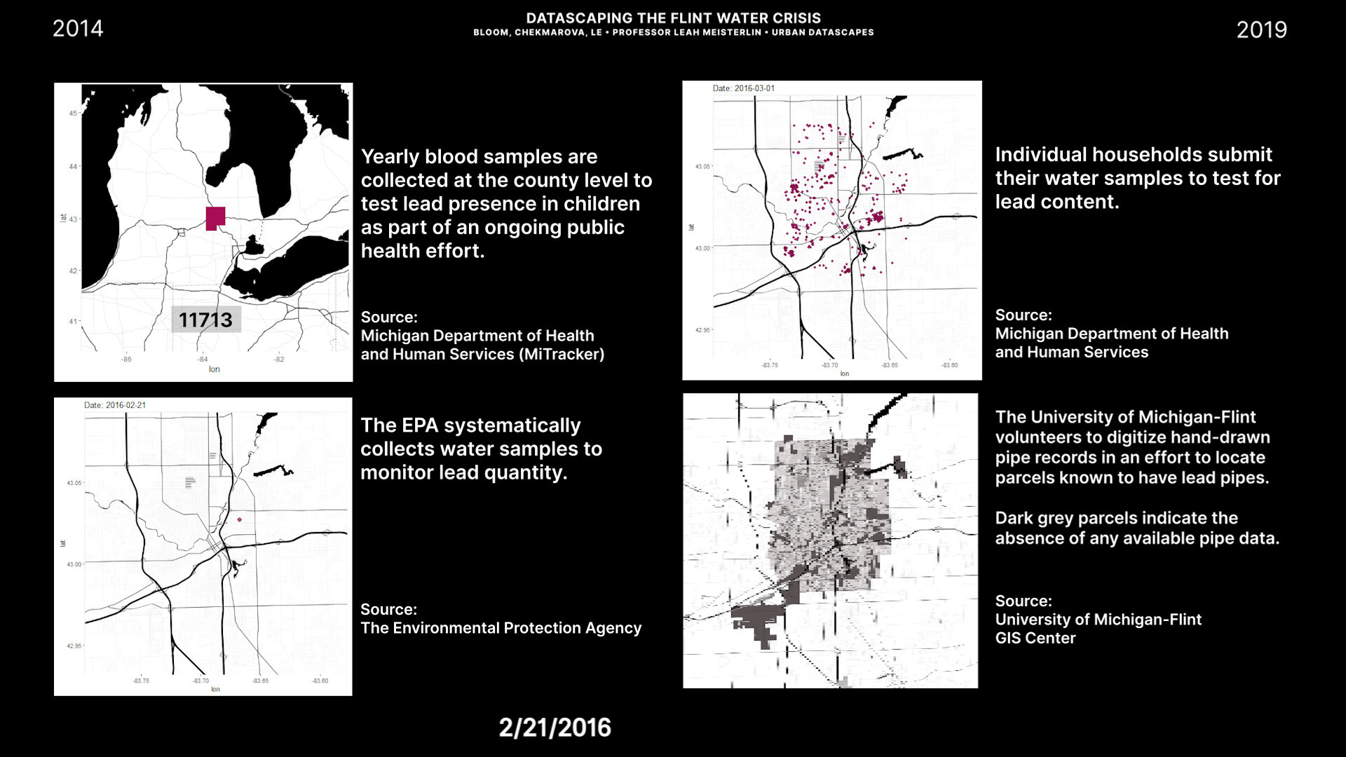
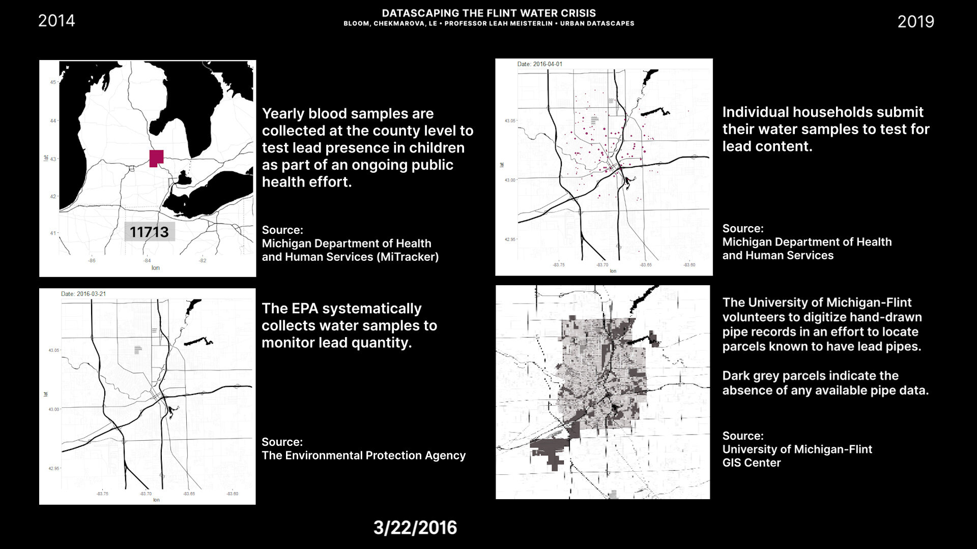
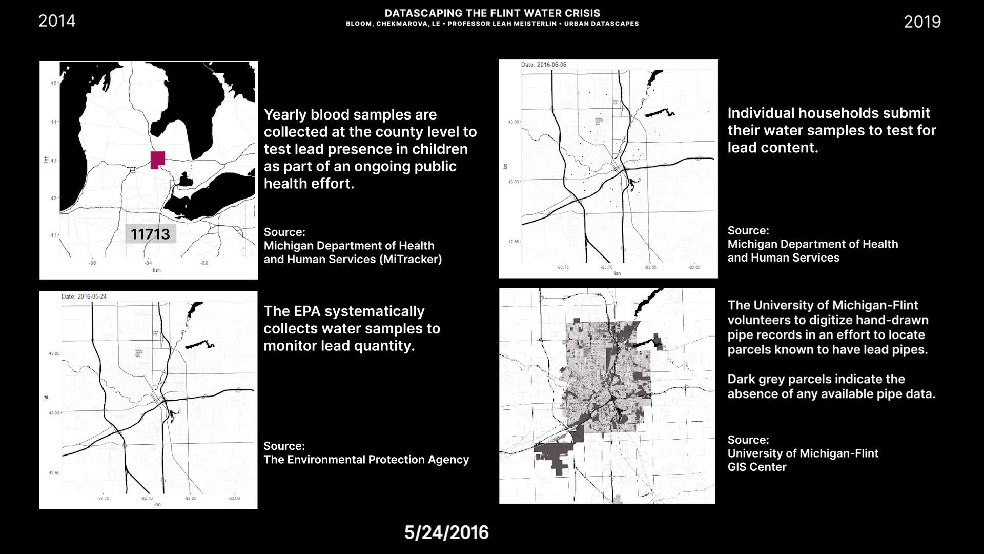
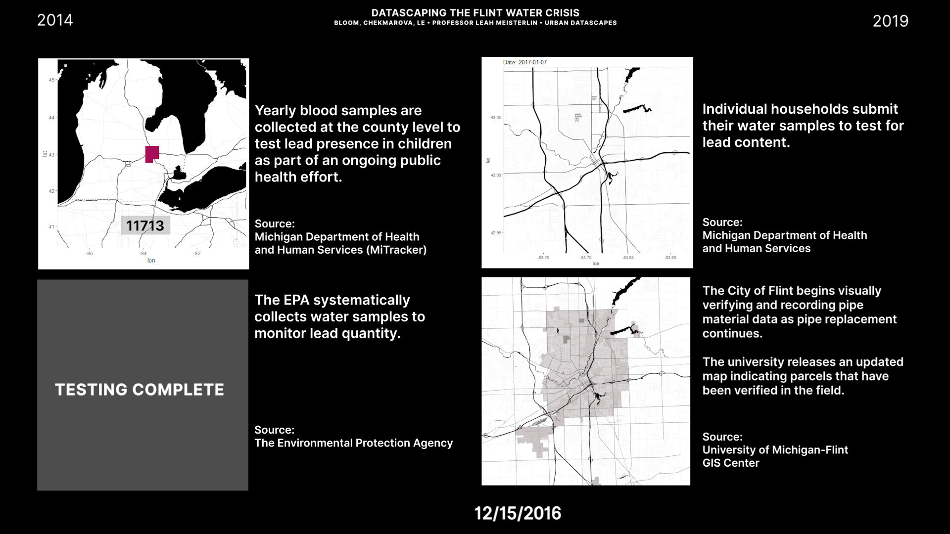
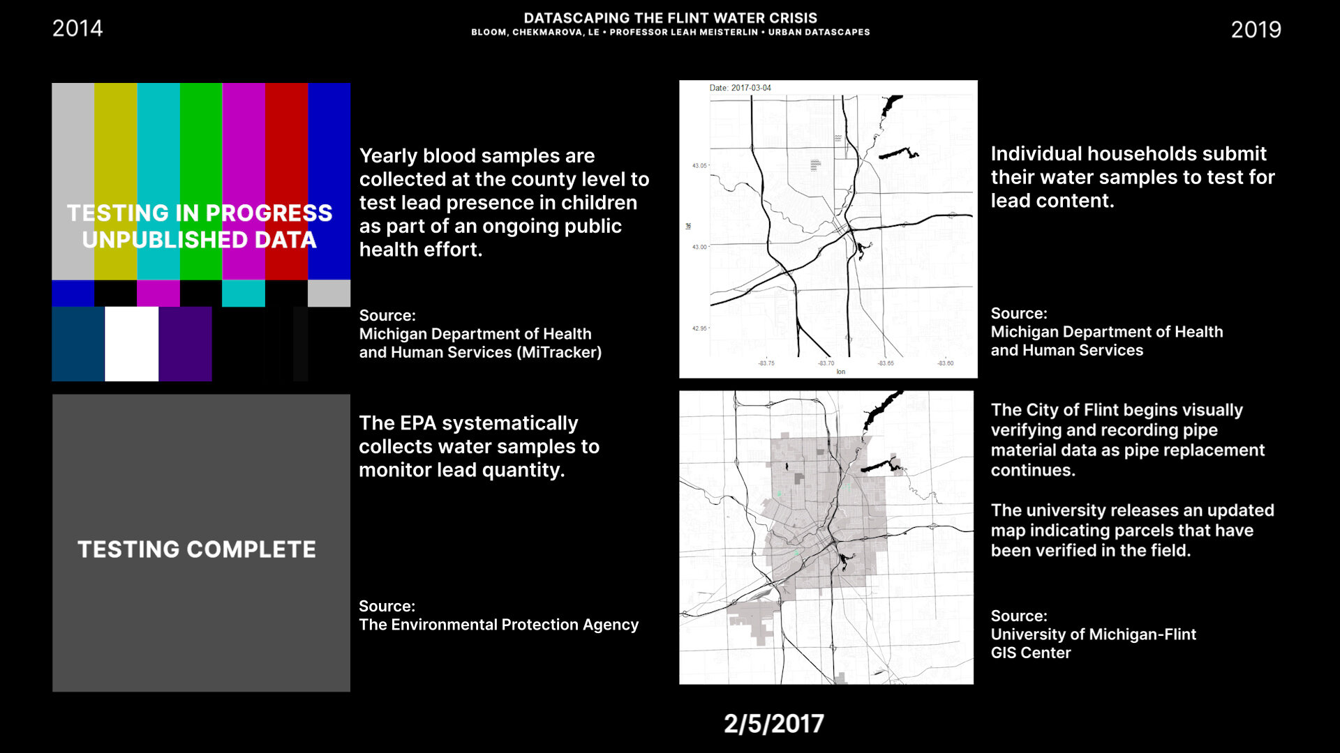
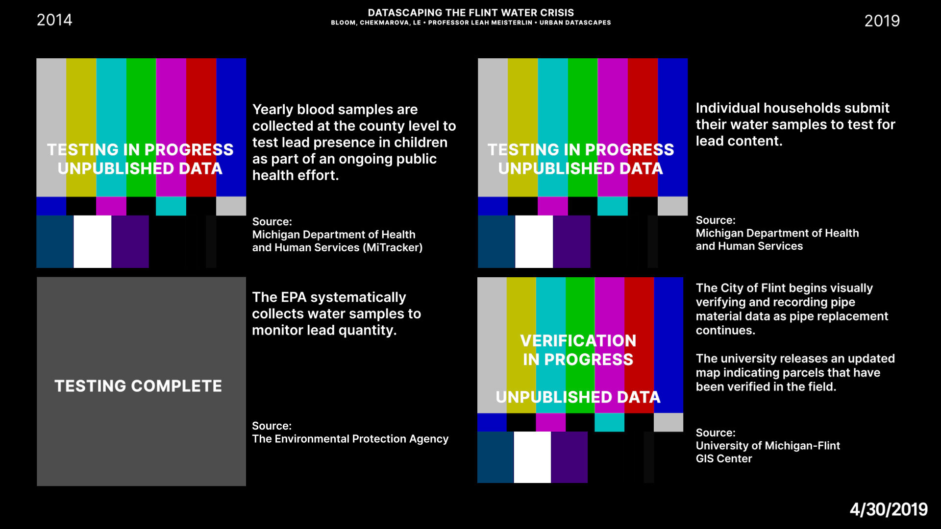

Julia Bloom, Mariya Chekmarova, Ri Le. “A Datascape of the Flint Water Crisis, 2014-2019.” [video]
Video stills included above.
From the project abstract:
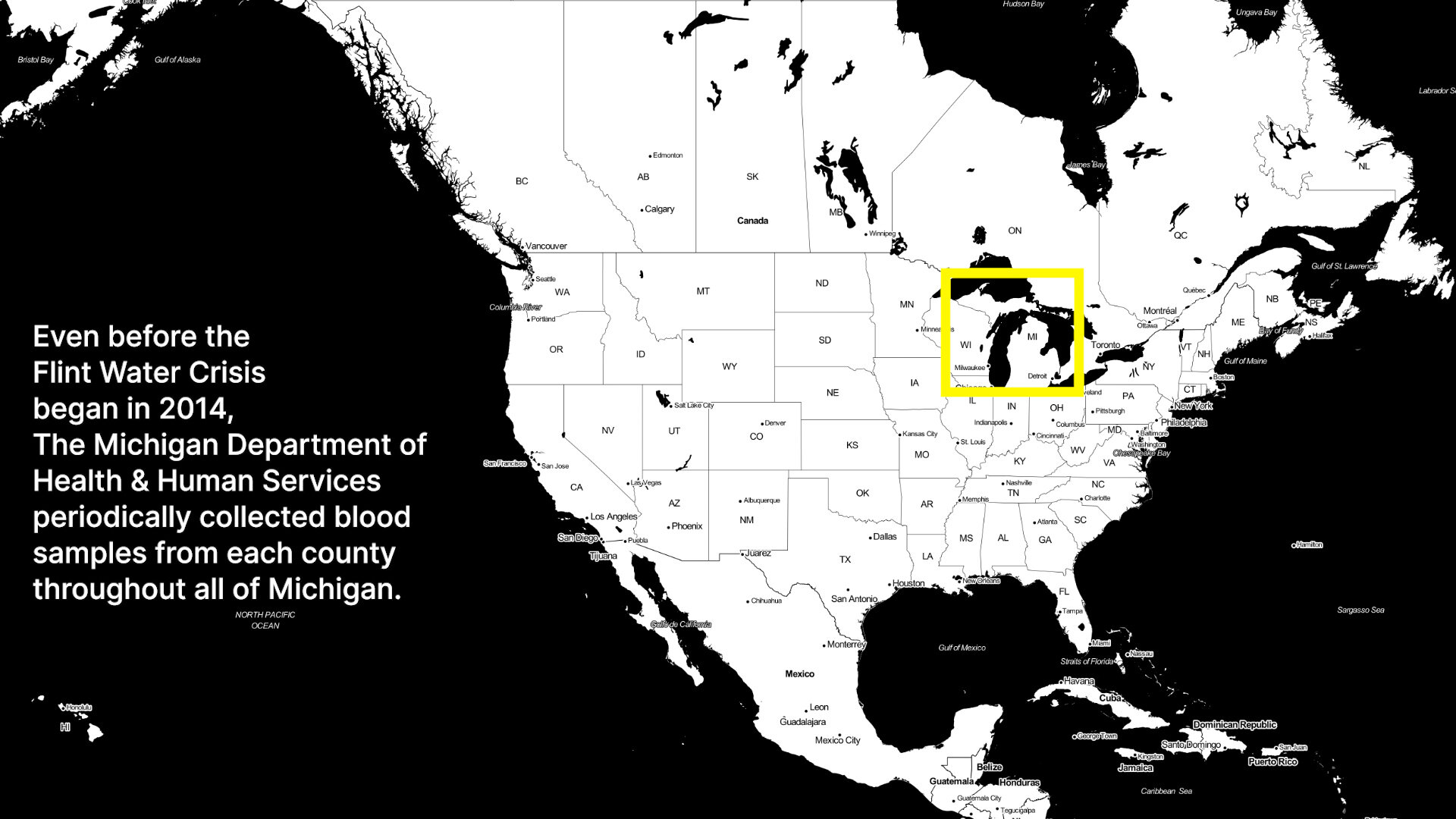
While this failure of government and local authorities to respond in a timely matter to a poorly executed decision was closely followed in news media, the crisis highlighted the invisibility of infrastructure data and the creation of new crisis dataset. For example, data related to the location and types of pipes located in Flint was stored in an analog format and was only digitized when the governor declared a state of emergency. Other pre-existing datasets such as blood lead levels in children collected by MDHHS were on a yearly basis nevertheless failed to alert authorities to the poor quality of the water. Crises datasets include water quality tests (collected by the EPA) and volunteered water quality tests (submitted by residents, tested by the state of Michigan). By visualizing each dataset along a timeline side-by-side we see the crisis unfold from the perspective of multiple governing bodies and decision-makers.. The use of static and references to screen monitors speaks to the visibility of the crises from the perspective of those monitoring it - from national organizations such as the EPA, down to the University of Michigan-Flint.
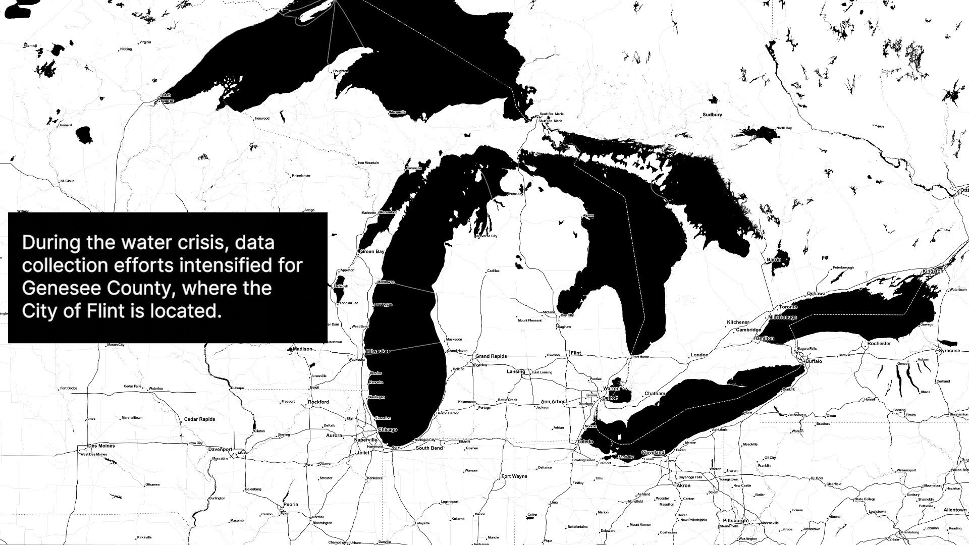
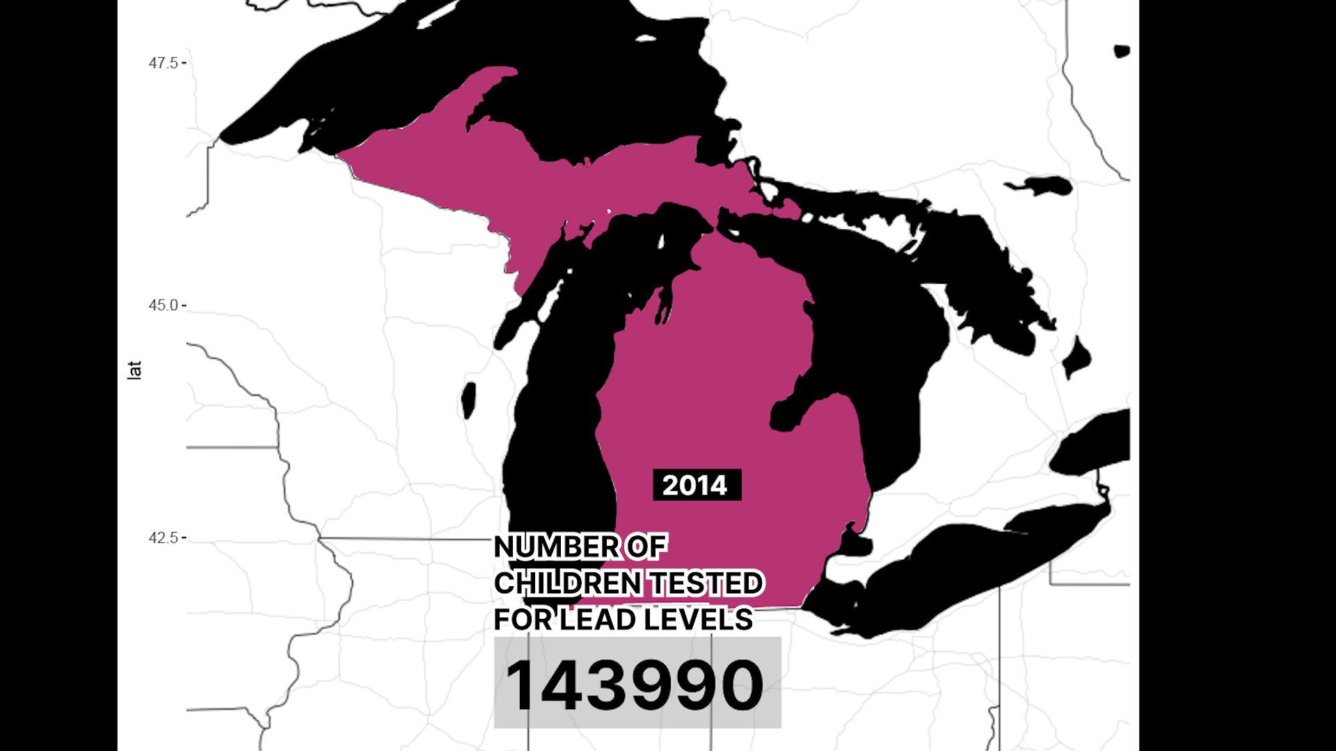
As the timeline progresses, these entities’ responses to new data are seen in their collection methods: for example, the MDHHS increased the number of blood samples in Genesee county during the years of the crisis to more closely monitor the health outcomes. Water samples volunteered by individual households show a rapid increase in 2016 as residents insisted on the empirical evidence showing poor water quality in a moment when officials were denying the claims. Water quality tests collected by the EPA served as a watchdog dataset to ensure proper management and compliance. Finally, the location of lead pipes was only digitized by researchers once the urgency of understanding the location of lead pipes was established.
All four datasets appear along the timeline at different times, for different durations. Their appearance is synonymous with the responsive nature by which they were created. They exist simultaneously only when government officials formally acknowledged the water crisis in Flint. Their duration is related to the goals of the particular data collector, with volunteered samples continuing to be submitted to this day, but EPA samples ceasing to exist once compliance was achieved. Together, they form a crisis dataset that illustrate the various dynamics that created a crisis out of a mistake.


Michael Montilla. “Redacted Transparency” [interactive, redacted research poster]
The project’s accompanying documentation and description included below.
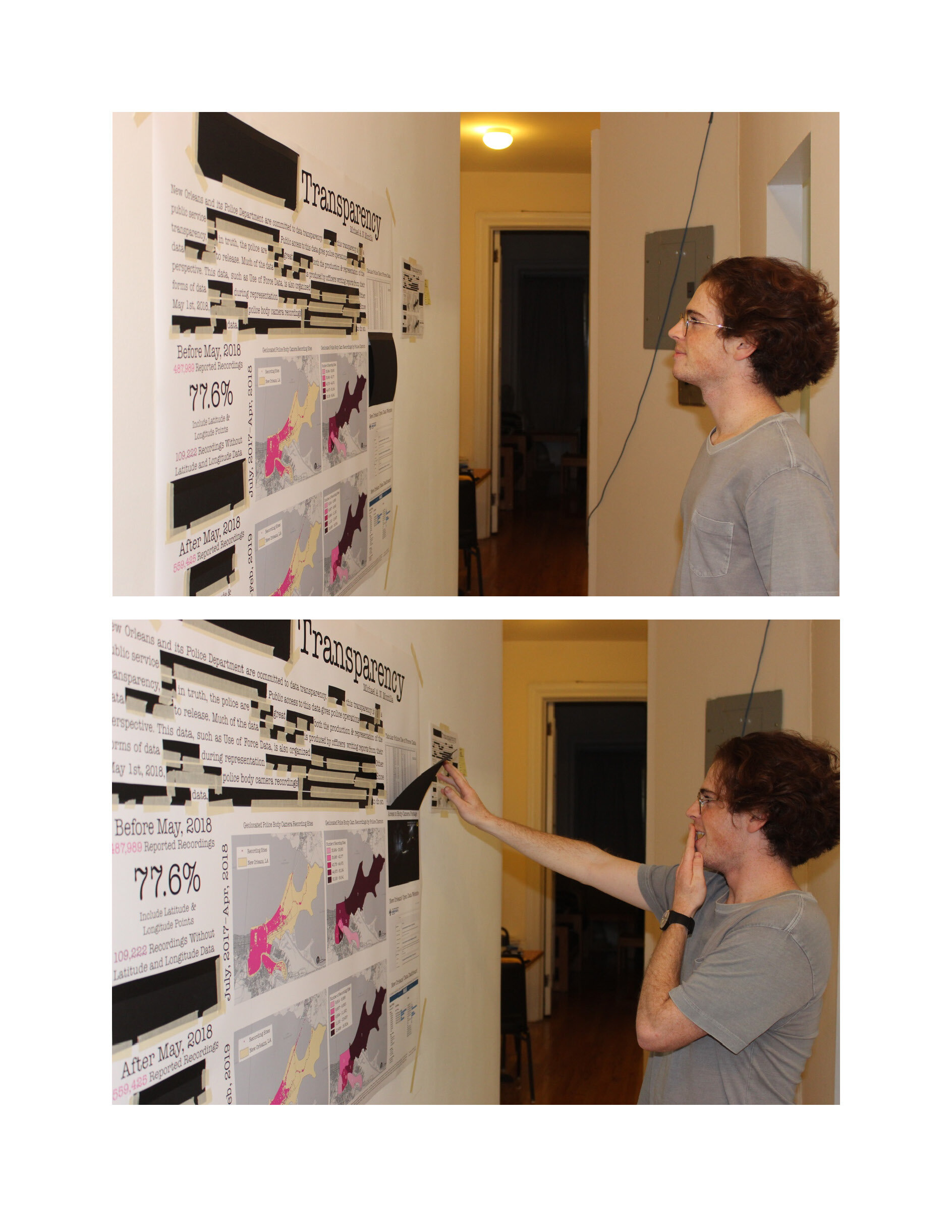
Project Abstract:
Redacted Transparency invites viewers to uncover the motivations behind the production and representation of open police data from New Orleans. The New Orleans police produce, and publicly release a considerable amount of data. Most of this data is represented in tabular form on the city’s open data website, and is updated very frequently, often daily (City of New Orleans, 2019a). This data is used to inform the city’s publicly available crime maps, as well as the city’s data analytics dashboard (Tableau Public, 2019). The availability, and contemporality of New Orleans police data provide the police with the appearance of transparency, but there are curious trends in the data suggesting other motivations affect its production and representation. Police officers produce most of the open data through standardized reports organized and completed with the officer’s and department’s interests in mind. An example of this bias is how tabular Use of Force data includes a field providing the “build” of the individual who the officer used force against. The police do not provide the same data about officers themselves, and often omit, or exclude information about officers’ employment history (City of New Orleans, 2019c). A representational pattern that Redacted Transparency examines in-depth is the scarcity of reported latitude and longitude points for police body camera recordings occurring after May 1st, 2018. Before this date, the location of most body camera recordings were listed in the metadata as latitude and longitude points. After this date, very few of the recordings’ metadata include this information (City of New Orleans (2019b). By exhibiting the available spatial data from the ten months prior to May 1st, 2018, alongside the available spatial data from the ten months after, Redacted Transparency reveals potential motivations behind clearly evident revisions. Much like the blackboxes within Redacted Transparency, each additional edit to the New Orleans police data has made the entirety of edits easier to notice. Mirroring dynamics caused by edits to the underlying data, Redacted Transparency will affect viewers at multiple points in time. Upon first sight, viewers can immediately see that the piece has been edited. Then, upon closer examination, they can see how the first few redactions leave solely indications of transparent police work. But Redacted Transparency becomes more nonsensical with each redaction, causing viewers to either except the data as is, or to question its purpose. The piece eventually entices viewers to explore the data further by attempting to expose what lies beneath each redaction. The appearance of transparency protects police from the scrutiny of residents and other urban entities. It is thusly worthy of criticism. Truly transparent data includes explanations about how and why the data has been edited. The data deployed by the New Orleans Police includes no such explanation. When explored, this data is ultimately far from what it initially claims to be.
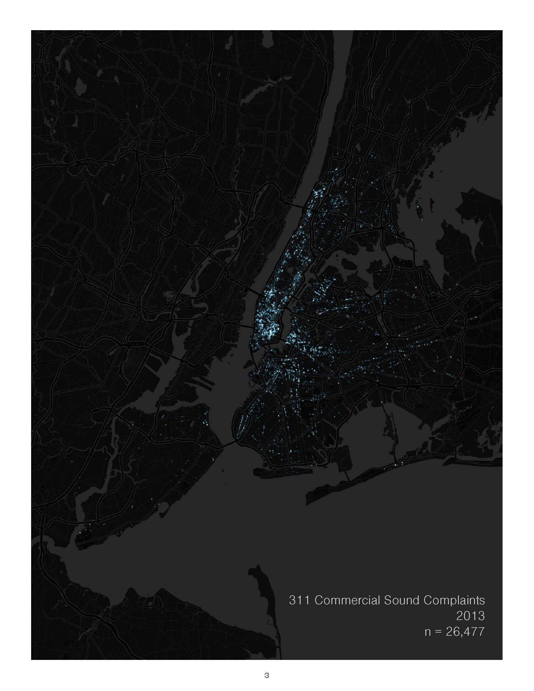
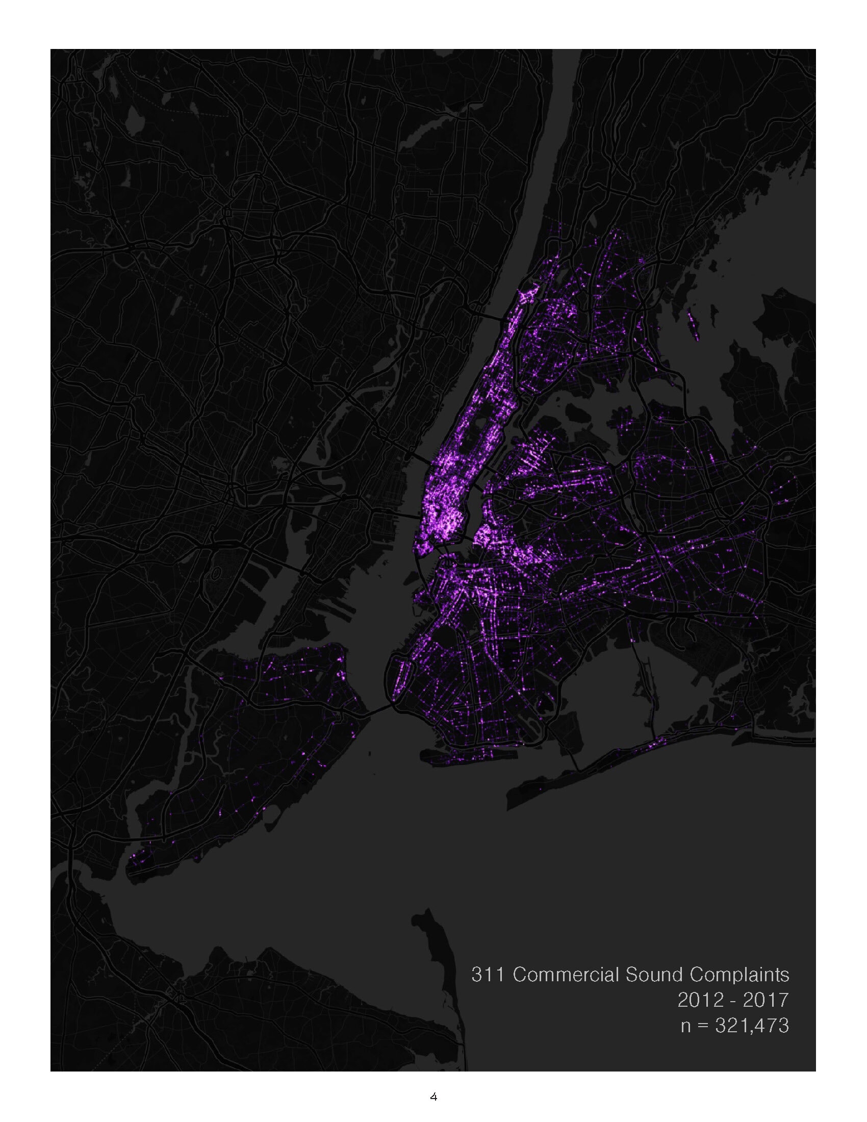
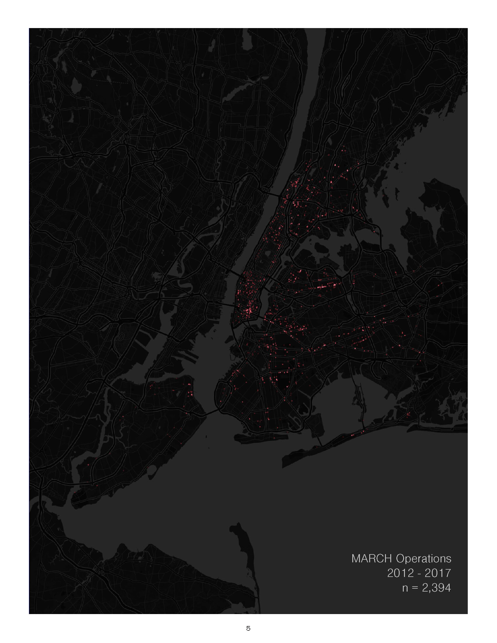
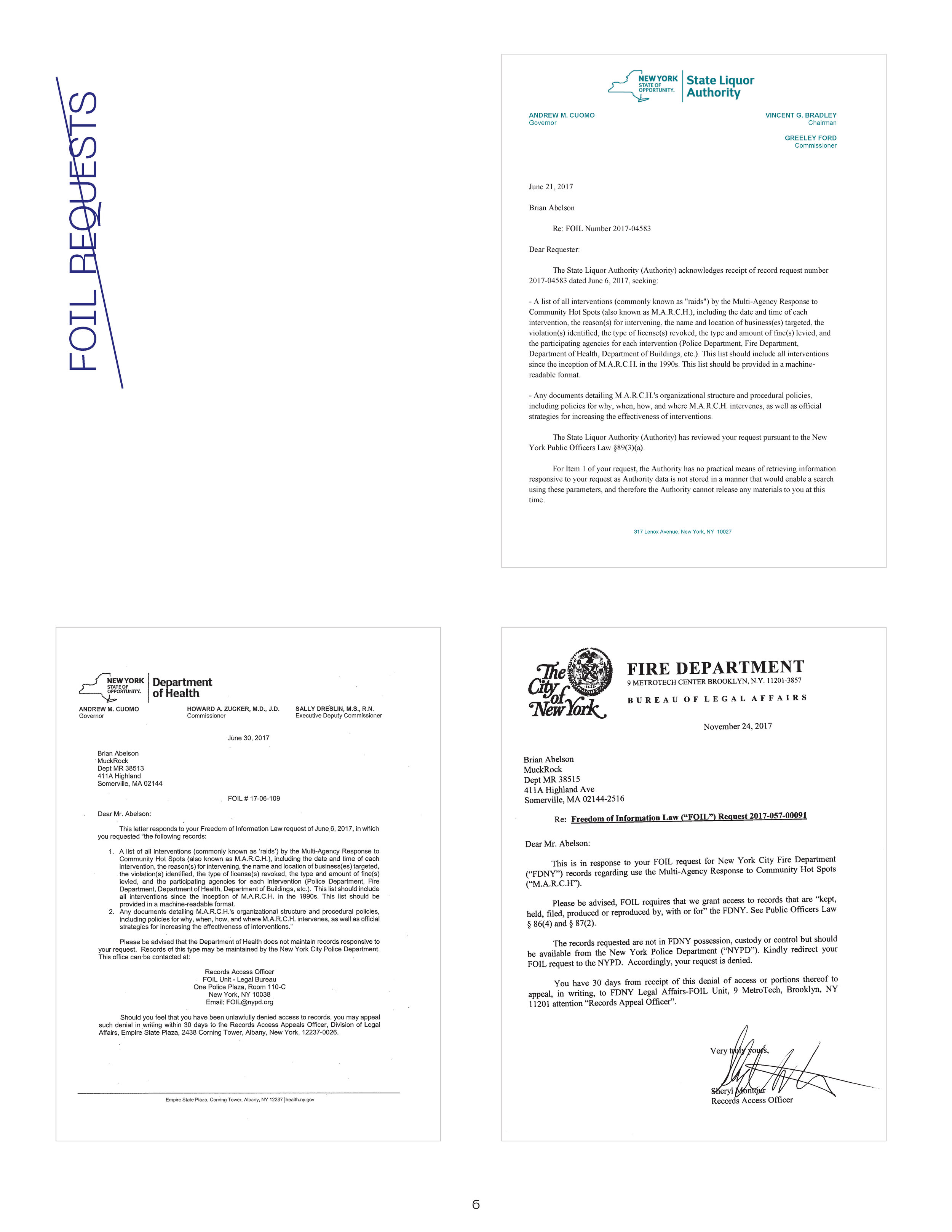
Kevin Borja. “Lost in the Sound: Exploring the anonymization and weaponization of NYC’s 311 System.” [video]
The project’s accompanying documentation and description included above.
the Project Abstract:
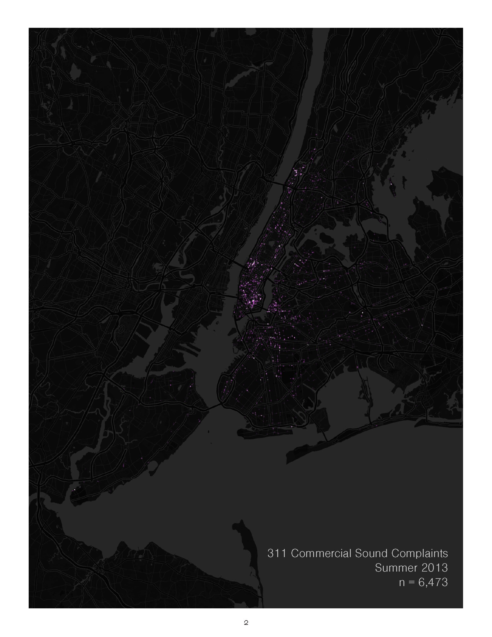
New York City has long been known as the ‘City that Never Sleeps.’ New York’s nightlife uses such as bars, clubs, food service, and recreation contributed to over $35 billion in economic output in 2016. However, that moniker and many of those uses have caused tension as reported through the City’s 311 system, referencing continual noise-related disputes between nightlife establishments and their residential neighbors who feel that their complaints are becoming lost in the sounds of the city.
However, 311 complaints can be, and are for the most part, anonymous. A user can make a complaint by making a phone call to 311 where an operator will make note of their accusations, then contact the corresponding city agency for further action if needed. Alternatively, a user can go onto the 311 website and write in their accusations without having provided any contact information. There are little to no ramifications for the party that reports a violation, but there can be great economic losses for business receiving the complaints, even when the complaints are unsubstantiated.
Nightlife venues in New York City began to see an increase in policing as a result of the Mayor Giuliani’s “Quality of Life” campaign in the 1990s. One initiative that was developed under this premise was the “Multi-Agency Response to Community Hotspots” program, commonly known as MARCH. MARCH is a concerted effort by the New York Police Department (NYPD), Fire Department (FDNY), Department of Health (DoHMH), Department of Buildings (DOB), Department of Environmental Protection, and the State Liquor Authority (SLA) to respond to nightlife venues that have been reported as problematic through the City’s 311 system.
If agencies respond, a MARCH intervention results in representatives from the aforementioned agencies entering a venue with heavy tactical gear who will then issue fines, often unrelated to the initial complaint. Other than 311 data, it’s largely unknown how to determine whether a venue will receive a MARCH intervention, as evidenced by the “black box” of information held by NYPD.
‘Lost in the Sound’ is an multimedia exploration of how human sensing of noise and anonymization of 311 data can be used to alter our ability to interact with the city.